
In a marketplace crowded with visual noise, many organizations are moving toward a quieter form of identity: the silent logo. This approach does not mean a logo has no personality or becomes invisible. Instead, it reflects a disciplined design philosophy in which restraint, clarity, and confidence replace excessive decoration, loud colors, and forced symbolism.
TLDR: A silent logo is a minimalist brand mark designed to communicate trust, sophistication, and stability without visual excess. It relies on proportion, typography, spacing, and subtle meaning rather than loud graphics or complicated storytelling. Quiet branding works especially well for companies that want to appear mature, premium, reliable, or timeless. However, simplicity must be intentional, not generic.
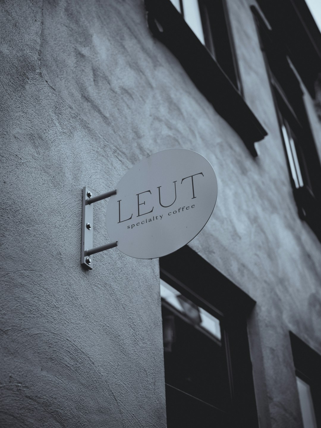
The Meaning of a Silent Logo
A silent logo is not merely a simple logo. It is a logo that uses visual restraint as a strategic asset. Its purpose is to communicate without shouting. In practice, this often means clean typography, limited color palettes, balanced spacing, and a mark that can function across many environments without losing dignity or recognition.
The word silent should not be misunderstood as passive. A silent logo can be powerful precisely because it avoids unnecessary distraction. It does not demand attention through complexity; it earns attention through confidence. This is the visual equivalent of a well-spoken person who does not need to raise their voice to be heard.
For many brands, especially those operating in professional services, technology, architecture, wellness, finance, luxury goods, and cultural institutions, quiet branding offers a way to express competence and longevity. It suggests that the brand does not need gimmicks to validate itself.
Why Minimalist Branding Has Become More Important
Modern audiences encounter thousands of brand impressions every day. Social feeds, packaging, apps, websites, advertisements, signs, and emails all compete for limited attention. In this environment, overly complex logos often become difficult to remember and harder to reproduce consistently.
Minimalist branding responds to this reality by making identity systems more adaptable. A quiet logo can work on a business card, mobile app icon, storefront, product label, social media avatar, or presentation deck with fewer compromises. The simpler the structure, the easier it is to scale and maintain.
There is also a cultural factor. Consumers are increasingly aware of exaggeration in marketing. Loud branding can sometimes feel insecure or manipulative, especially in industries where trust is essential. A restrained identity can signal seriousness, transparency, and patience.
Core Principles of Quiet Logo Design
Although silent logos often appear effortless, effective minimalist design is rarely accidental. A successful quiet identity is usually built on several precise principles.
- Clarity: The logo should be immediately readable or recognizable, even at small sizes.
- Proportion: Spacing, line weight, letterforms, and symbol geometry must feel balanced.
- Restraint: Every visual element should have a reason to exist. Decoration without purpose weakens the concept.
- Consistency: The logo must work with the broader brand system, including type, color, layout, and tone of voice.
- Timelessness: The design should avoid relying too heavily on temporary trends.
These principles are simple to list but difficult to execute. Removing elements from a logo can expose weaknesses in concept and craft. When there are fewer visual devices, every detail becomes more important.
The Role of White Space
White space, sometimes called negative space, is one of the most important features of silent branding. It gives the logo room to breathe and helps guide the viewer’s attention. In quiet design, space is not emptiness; it is structure.
A logo surrounded by sufficient white space tends to feel more premium and more deliberate. It suggests control. It also improves practical performance because the logo is less likely to become visually crowded when placed near photographs, text, or interface elements.
Strong white space can also create subtle meaning. A symbol may use negative space to form a hidden shape, or a wordmark may use generous letter spacing to communicate calm and precision. These decisions should be subtle enough to support the identity without turning into tricks.
Typography as the Primary Voice
In many silent logos, typography carries most of the brand personality. A carefully selected or custom-modified typeface can communicate more effectively than an elaborate icon. Serif type may suggest heritage, editorial authority, or craftsmanship. Sans serif type may suggest modernity, efficiency, or neutrality. Humanist forms can feel warmer, while geometric forms can feel more systematic.
The key is not simply choosing a fashionable font. The letterforms must align with the actual character of the organization. A health technology company, for example, may need a type style that balances innovation with reassurance. A legal firm may require authority without appearing old-fashioned. A luxury skincare brand may seek elegance without fragility.
Small refinements often matter: adjusted kerning, modified terminals, custom ligatures, or a slightly altered letterform can make a wordmark feel distinctive while still remaining quiet. These refinements help prevent minimalism from becoming anonymity.
Color in Silent Branding
Quiet logos often use limited color palettes, but limited does not mean dull. Black, white, gray, beige, navy, deep green, muted brown, and soft metallic tones are common because they communicate stability and restraint. However, the right color depends heavily on the brand’s industry, audience, and positioning.
A single strong color can still be part of silent branding if it is used with discipline. For example, a deep red, cobalt blue, or forest green can create recognition without visual noise. The issue is not whether the color is bright or muted; the issue is whether it is controlled.
Quiet branding uses color as a signal, not as a distraction. A restrained palette also helps maintain consistency across print, digital, environmental, and product applications.

When a Silent Logo Is the Right Choice
A silent logo is not suitable for every organization. Some brands need high-energy visuals because they operate in entertainment, youth culture, gaming, sports, or highly promotional retail. However, many brands benefit from a quieter presence, particularly when credibility is central to the customer relationship.
Silent logo concepts are often appropriate for:
- Financial and legal services where stability, discretion, and professionalism are essential.
- Luxury and lifestyle brands where understatement can suggest exclusivity.
- Technology companies that want to appear clear, intelligent, and efficient.
- Healthcare and wellness brands that need calm, reassurance, and trust.
- Architecture and design studios where precision and aesthetic judgment must be evident.
- Cultural institutions where the identity should support content rather than overpower it.
The decision should be strategic. A quiet identity must reflect the organization’s real values and customer expectations. If the brand experience is chaotic or inconsistent, a minimalist logo alone will not create trust.
The Risk of Being Too Generic
The greatest danger in silent logo design is blandness. Minimalism can easily become a shortcut: plain text, neutral color, and no meaningful distinction. This may look clean at first glance, but it will not build recognition over time.
A trustworthy silent logo needs a point of view. That point of view may appear in the rhythm of the typography, the geometry of a symbol, the relationship between mark and word, or the way the logo behaves within a larger identity system. The distinction may be quiet, but it must still exist.
For example, two wordmarks may both use black lettering on a white background. One may feel generic because it depends entirely on a common typeface. The other may feel proprietary because its spacing, proportions, and details have been carefully considered. The difference is subtle, but audiences often sense it, even if they cannot explain it.
Silent Branding Beyond the Logo
A logo is only one part of a brand identity. Quiet branding becomes more convincing when it extends across the full system. This includes layout, photography, messaging, packaging, motion, signage, and customer communication.
A serious minimalist brand system may use:
- Consistent margins and grids to create order and recognizability.
- Measured typography with clear hierarchy and restrained emphasis.
- Calm photography that avoids excessive staging or artificial emotion.
- Precise language that favors substance over slogans.
- Limited graphic elements used consistently rather than decoratively.
When these parts work together, the logo does not need to carry the entire brand expression alone. It becomes the signature of a broader system built on disciplined choices.
How Silent Logos Build Trust
Trust is often created through consistency, clarity, and restraint. A silent logo can support all three. It makes a brand easier to recognize, easier to reproduce, and easier to integrate across different contexts. It also reduces the risk of appearing overly trendy or unserious.
In professional environments, restrained identity design can imply that the organization is focused on the work rather than on spectacle. In luxury markets, it can imply that the product or service has enough substance not to rely on aggressive persuasion. In technology, it can communicate simplicity and usability.
This does not mean that audiences automatically trust every minimalist logo. Trust comes from repeated experience. However, a quiet logo can create an appropriate first impression and support a brand promise over time.
Practical Criteria for Evaluating a Silent Logo
Before adopting a minimalist logo, an organization should evaluate it carefully. The design may look attractive in isolation but fail in real-world conditions. A serious review should consider both aesthetics and function.
Important questions include:
- Is the logo legible at very small sizes?
- Does it remain recognizable in black and white?
- Can it work across digital, print, signage, and packaging?
- Does it feel appropriate for the audience and industry?
- Is there a distinctive feature that prevents it from feeling generic?
- Does the logo align with the brand’s tone of voice and customer experience?
- Will the design still feel credible in five or ten years?
These questions help separate meaningful restraint from underdeveloped design. Minimalist branding should reduce complexity, not reduce thought.
The Future of Quiet Branding
As digital environments become faster and more crowded, the value of clear identity systems will likely continue to grow. Silent logos are well suited to responsive design, small screens, app ecosystems, and international markets. They can cross language barriers more easily when supported by strong visual structure.
At the same time, quiet branding will need to evolve. If too many brands adopt the same neutral appearance, audiences may begin to see minimalism as predictable. The strongest silent logos will be those that combine restraint with specificity. They will be simple, but not empty; calm, but not cold; timeless, but not detached from culture.
Conclusion
A silent logo is a serious branding choice. It reflects confidence, discipline, and respect for the audience’s attention. When executed well, it can help a brand appear trustworthy, refined, and durable in a noisy marketplace.
The most effective quiet branding concepts are not defined by the absence of design, but by the presence of judgment. Every line, space, color, and letter must serve a purpose. In that sense, the silent logo is not silent because it says nothing. It is silent because it says only what matters.