Use paper first when speed matters most. Use Figma when the idea needs clicks, sharing, polish, or developer handoff. That is the simple answer.
TLDR: Paper is best for the first 30 minutes of rapid UI prototyping. Figma is better after your team agrees on the basic flow. For example, a product team can sketch 12 checkout screen ideas on paper in 20 minutes, then turn the best 2 into clickable Figma prototypes in 90 minutes. In small tests, teams often cut early rework by about 25% to 40% when they sketch before opening design software.
Paper vs Figma: the quick match
Paper is fast. Figma is powerful. Paper is messy in a good way. Figma is clean, shared, and reusable.
The real question is not which tool is “better.” The better question is this:
What stage is your idea in?
- Messy idea? Use paper.
- Clear concept? Use Figma.
- Need team feedback? Use Figma.
- Need 10 ideas fast? Use paper.
- Need a clickable demo? Use Figma.
That is the playbook.
Why paper still wins the first round
Paper feels old. It is not. It is a cheat code.
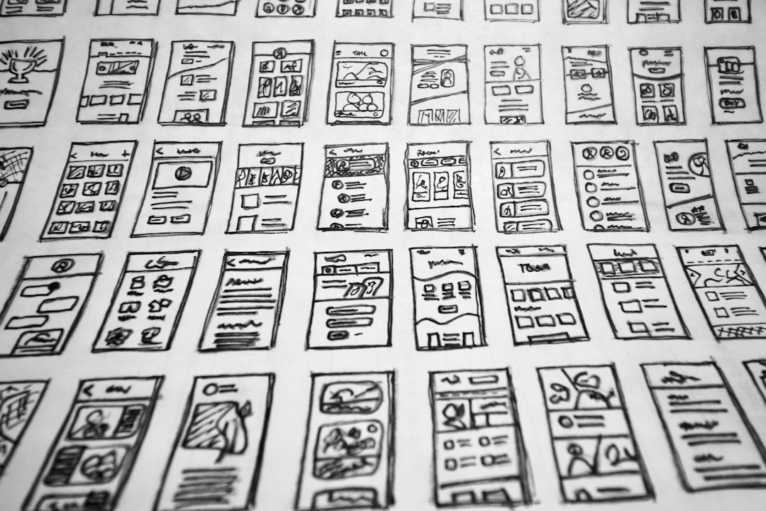
You grab a pen. You draw a box. You add a button. Done. No layers. No grids. No plugins. No “why is this frame inside another frame inside a group” moment.
Honestly, it feels like some design tools make you earn the right to draw a rectangle. Paper does not care. Paper lets bad ideas exist for 12 seconds. Then you cross them out.
That is useful.
Rapid UI prototyping is not about making a pretty screen first. It is about finding the right screen. Paper helps because it lowers the pressure.
People sketch more freely. They share rough ideas sooner. They do not defend a button just because they spent 14 minutes aligning it.
What paper is great at
- Speed: You can sketch a screen in under a minute.
- Quantity: You can try many ideas fast.
- Low pressure: Nobody expects a paper sketch to look perfect.
- Team rooms: Everyone can join, even non designers.
- Early flows: Login, checkout, onboarding, dashboards, and forms are easy to map.
Paper also makes meetings less weird. Give people markers and sticky notes. Suddenly the quiet person has the best idea in the room.
It also exposes weak flows fast. If your checkout needs seven paper screens and three sticky notes saying “maybe,” something is wrong.
Where paper falls apart
Paper is not magic. It has limits.
You cannot click it. You cannot share it neatly with a remote team. You cannot test real spacing. You cannot hand it to a developer and say, “Please build this exactly.”
Expect to waste time on photos too. Someone takes a picture of the sketch. The lighting is bad. A thumb covers the main button. Then the image gets buried in a chat thread named “ideas final final.” Great.
Paper also struggles with states. Hover states. Error states. Loading states. Empty states. These matter. Paper can show them, but it gets clumsy fast.
Why Figma wins the second round
Figma is where rough ideas grow up.
You can build screens. Link them. Add components. Invite people. Collect comments. Test flows. Share a link. That is a big deal.
Once the core idea is clear, Figma becomes much faster than paper. You can duplicate frames. Reuse buttons. Change colors across a design system. Adjust spacing with care.
Figma also helps teams speak the same visual language. A product manager can comment on the pricing screen. A developer can inspect spacing. A founder can click through the demo before a client call.
That makes Figma strong for remote work. Paper is great around a table. Figma is great across time zones.
What Figma is great at
- Clickable prototypes: Users can tap through a flow.
- Visual polish: You can test layout, type, colors, and spacing.
- Team feedback: Comments sit next to the design.
- Components: Buttons, cards, menus, and inputs can be reused.
- Developer handoff: Measurements and styles are easier to inspect.
Figma is also great for testing real UI behavior. Say you are designing a food delivery app. On paper, the “Add to cart” button is just a box. In Figma, you can show the cart count rising from 0 to 1. You can show the next screen. You can show the error message if the restaurant is closed.
That feels closer to the real product.
Where Figma can slow you down
Figma can trick you into polishing too early.
You open a blank file. You choose a frame. Then a font. Then a color. Then you fix a 1 pixel alignment issue. Suddenly 45 minutes are gone, and you still have one idea.
That drives me crazy. Early UI work should not feel like arranging tiny furniture in a glass box.
Figma also carries social pressure. A polished mockup looks “decided,” even when it is not. Stakeholders may fall in love with surface details. They may argue about blue versus green before the flow even works.
This is why paper matters. Paper screams, “This is still an idea.” That is healthy.
A simple workflow that works
Use both. Do not make this a tool war.
Here is a practical flow:
- Start with the problem. Write one sentence. Example: “Users need to book a dog walker in under 2 minutes.”
- Sketch 6 to 10 paper screens. Keep each one ugly and fast.
- Pick the best flow. Do not vote for the prettiest sketch. Vote for the clearest path.
- Test it with 3 people. Ask them what they think each button does.
- Move the winner into Figma. Build only the screens needed for the main task.
- Make it clickable. Keep it simple. No fancy motion yet.
- Test again. Watch where people pause, tap wrong, or ask questions.
This keeps the speed of paper and the strength of Figma.
User case: a tiny app team
Picture this. A three person team is building a budgeting app.
They need a first prototype by Friday. On Monday morning, they sketch 18 paper screens. It takes 50 minutes. They find three possible home screen ideas. One is too crowded. One hides the savings goal. One makes the next action obvious.
They choose the third one.
By Tuesday afternoon, they build a simple Figma prototype with 9 screens. On Wednesday, they test it with 5 users. Three users complete the “create a budget” task with no help. Two users get stuck on category selection.
That is useful data. The team fixes the category screen. No one spent a week polishing the wrong idea.
When to choose paper
Choose paper when ideas are unclear.
- You are planning a new feature.
- You need many options fast.
- You are running a workshop.
- You want input from non designers.
- You are mapping a user flow.
Paper is best before commitment. It is a playground. Use it to think.
When to choose Figma
Choose Figma when the idea needs shape.
- You need a clickable prototype.
- You need remote feedback.
- You need to test realistic screens.
- You use a design system.
- You need to share work with developers.
Figma is best after direction. It is a workshop bench. Use it to build.
The best answer
Paper first. Figma second.
That pairing is hard to beat. Paper helps you find better ideas. Figma helps you prove and refine them.
If you start in Figma too soon, you may polish a weak flow. If you stay on paper too long, you may miss real interaction problems.
So keep the rhythm simple. Sketch fast. Pick the best path. Build it in Figma. Test it. Fix it. Then repeat.
Rapid UI prototyping should feel quick, clear, and a little playful. Paper gives you the fun mess. Figma gives you the working model. Together, they make better products with less drama.