
Mobile visitors are quick. They tap fast. They scroll faster. If your landing page feels slow, confusing, or crowded, they vanish like a snack at a party.
TLDR: A great mobile landing page is fast, clear, and easy to use. Put your main offer and button near the top. Keep forms short, text simple, and images light. Make every tap feel obvious, smooth, and worth it.
Why Mobile Landing Pages Matter
Most people browse on their phones. They shop on buses. They compare prices in stores. They sign up while waiting for coffee.
That means your mobile landing page has one big job: help people act without making them think too hard.
A desktop page can spread out. A mobile page cannot. Space is tiny. Attention is tiny. Patience is even tinier.
So your page needs to be lean. It needs to guide the visitor with friendly signs. Like a tiny tour guide in their pocket.
1. Start With One Clear Goal
Do not ask your mobile page to do ten things. It will panic. So will your visitor.
Pick one goal. Just one.
- Buy now
- Book a call
- Download an app
- Join a list
- Start a free trial
Every part of the page should support that goal. The headline. The image. The button. The proof. The form.
If something does not help the goal, cut it. Be brave. Your landing page is not a museum. It is a path.
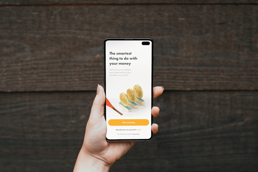
2. Put the Main Message Above the Fold
The “fold” is what people see before they scroll. On mobile, this space is small. Use it wisely.
Your first screen should answer three questions:
- What is this?
- Why should I care?
- What should I do next?
Use a short headline. Add a helpful subheading. Then show a clear button.
For example:
Headline: “Plan Healthy Meals in 5 Minutes.”
Subheading: “Get simple weekly meal plans made for busy people.”
Button: “Start My Free Plan.”
Simple wins. Fancy often confuses.

3. Make Your Call to Action Big and Tappable
Your call to action is the star. Treat it like one.
On mobile, buttons must be easy to tap. No tiny links. No hidden buttons. No “Where do I click?” games.
Use button text that says what happens next.
- Good: “Get My Free Guide”
- Good: “Book My Demo”
- Good: “Start Free Trial”
- Less good: “Submit”
- Less good: “Click Here”
Also, repeat the button. Put one near the top. Add another after benefits. Add one near the end. Do not make people scroll back to act.
4. Keep Copy Short and Punchy
Mobile users do not read like they are curled up with a novel. They scan. They skim. They hunt for value.
So write in short chunks.
Use:
- Short sentences
- Short paragraphs
- Clear headings
- Bullet points
- Bold text for key ideas
Avoid big blocks of text. They look scary on a phone. Like a wall of homework.
Here is a useful trick. Read your copy out loud. If you run out of breath, shorten it. If it sounds stiff, loosen it.
5. Focus on Benefits, Not Just Features
Features tell what something does. Benefits tell why it matters.
People want outcomes. They want saved time. Less stress. More money. Better sleep. Fewer headaches.
Try this format:
- Feature: “Automatic reports.”
- Benefit: “See what changed without digging through data.”
Another example:
- Feature: “One tap checkout.”
- Benefit: “Buy in seconds, even with one hand.”
Lead with the benefit. Then support it with the feature.
6. Make the Page Load Fast
Speed matters. A lot. If your page loads slowly, visitors leave. They do not wait politely. They are gone.
To keep things fast:
- Compress images
- Use fewer scripts
- Avoid heavy backgrounds
- Limit pop ups
- Use clean code
A fast page feels trustworthy. It also feels more professional. Nobody wants to buy from a page that loads like it is pulling a wagon uphill.

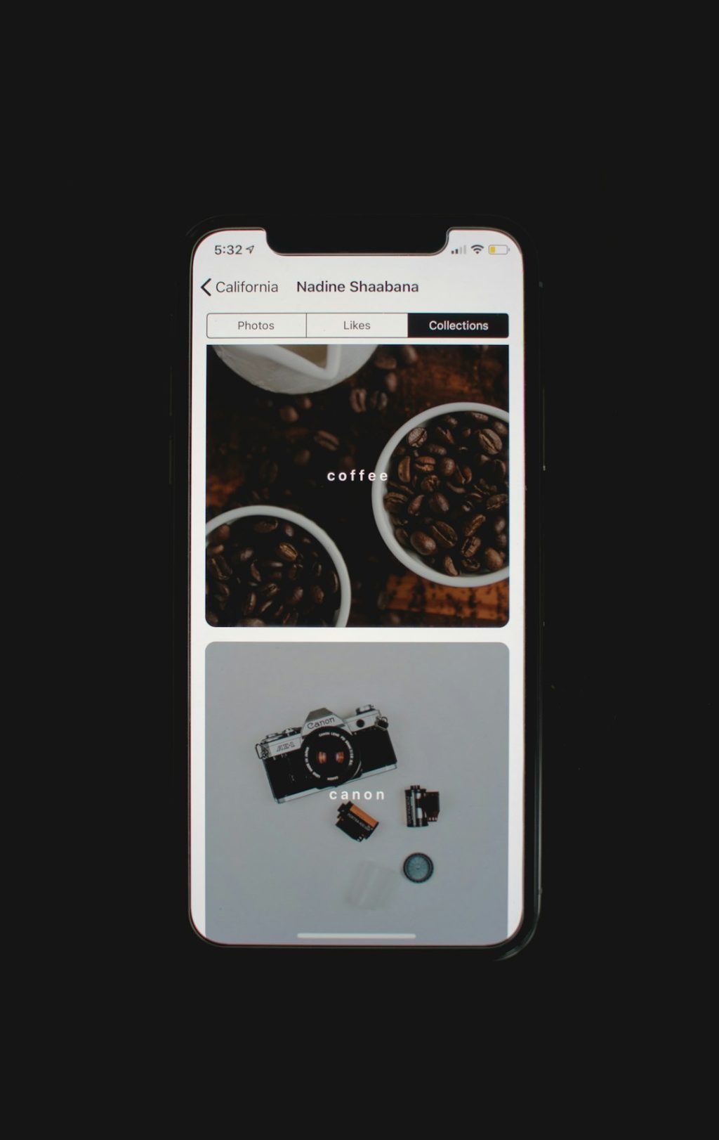
7. Use Images That Help the Message
Images can boost conversions. But only if they do a job.
Use visuals that show:
- The product in action
- A happy customer
- The result people want
- A simple before and after
Avoid random stock photos. If your page sells accounting software, a photo of two people pointing at a salad will not help.
Keep images light. Crop them for mobile. Make sure faces, products, and text are easy to see on small screens.
8. Build Trust Quickly
Mobile visitors may not know you yet. So earn trust fast.
Add proof near your offer. Keep it compact.
- Customer reviews
- Star ratings
- Short testimonials
- Security badges
- Press mentions
- Number of users or customers
Use real names and real details when possible. “This saved me 4 hours a week” is stronger than “Great service.”
Trust does not need to shout. It just needs to show up at the right time.
9. Make Forms Tiny
Long forms are conversion killers on mobile. Typing on a phone is not fun. Especially with big thumbs. Or cold fingers. Or both.
Ask only for what you need right now.
- Name
- Maybe phone number
That is often enough.
If you need more details, ask later. After the first conversion. Once people are more committed.
Also use the right keyboard type. Show a number keypad for phone numbers. Show an email keyboard for email fields. Small details feel magical.
10. Keep Navigation Minimal
A landing page is not a full website. It should not invite visitors to wander away.
Hide or reduce navigation links. Remove extra menu items. Keep the focus on the main action.
If you must include links, keep them useful. For example, terms, privacy, or support. But do not place five shiny exits at the top of the page.
Think of your landing page like a slide. Visitors should slide toward the button. Not escape through side doors.
11. Design for Thumbs
People hold phones in different ways. Many use one thumb. This matters.
Place important buttons where they are easy to reach. Leave space around clickable items. Do not stack links too close together.
If people tap the wrong thing, they get annoyed. Annoyed people do not convert.
Make tap targets large. Give them breathing room. Your visitor’s thumb will thank you.
12. Test, Learn, and Improve
No landing page is perfect forever. People change. Offers change. Phones change. Your page should improve too.
Test one thing at a time:
- Headline
- Button text
- Hero image
- Form length
- Social proof placement
Do not guess too much. Watch the numbers. Look at taps, scroll depth, form starts, and completed conversions.
Also check real recordings or heatmaps if you can. They show where people get stuck. Sometimes the problem is tiny. Like a button that looks disabled. Or a form field that breaks on one phone size.
Final Thoughts
A high converting mobile landing page does not need to be flashy. It needs to be clear. Fast. Trustworthy. Easy.
Give visitors one strong reason to care. Give them one clear action to take. Remove the bumps, clutter, and confusion.
When your page feels smooth, people keep going. When it feels simple, people say yes. And that is the whole game.