Widgetsmith has become one of the most popular apps for anyone who wants a more personal, organized, and visually appealing iPhone or iPad Home Screen. Instead of relying only on standard Apple widgets, users can create custom displays for calendars, photos, weather, reminders, clocks, health data, and more. With the right approach, Widgetsmith can turn an ordinary device layout into a practical dashboard that reflects a person’s style, schedule, and daily priorities.
TLDR: Widgetsmith works best when users plan their Home Screen layout before creating widgets. The most effective setups combine useful information, consistent colors, readable fonts, and carefully selected widget sizes. Scheduling widgets by time of day can make an iPhone or iPad feel more dynamic and helpful. A clean design usually looks better than a crowded one, especially on smaller screens.
Understanding What Widgetsmith Does
Widgetsmith allows users to create custom widgets in different sizes and styles for both iPhone and iPad. It supports small, medium, large, and, on iPad, larger widget layouts depending on the device and iPadOS version. Each widget can display different types of information, such as photos, calendars, reminders, weather, tides, astronomy data, health statistics, and custom text.
The app is especially useful because it gives users control over appearance. Fonts, tint colors, background colors, borders, photo choices, and themes can be customized to match a specific aesthetic. Some users prefer a minimalist setup with neutral tones, while others create bright seasonal designs, productivity dashboards, or photo-centered layouts.

Start With a Home Screen Plan
One of the best Widgetsmith tips is to plan the layout before creating any widgets. Many users begin by making several widgets immediately, then discover that the sizes, colors, or functions do not work well together. A better method is to decide which Home Screen pages will serve which purpose.
For example, one page might focus on productivity, another on wellness, and another on personal photos or entertainment. On an iPad, users may prefer a dashboard-style layout with large widgets for calendar events, weather, and reminders. On an iPhone, where space is more limited, a simple mix of one medium widget and several app icons often looks cleaner.
- Productivity page: calendar, reminders, clock, and task-related widgets.
- Wellness page: activity data, motivational text, weather, and calming images.
- Personal page: family photos, favorite quotes, countdowns, and aesthetic designs.
- Information page: time, date, battery-related apps, weather, and news apps nearby.
Choose the Right Widget Size
Widget size has a major effect on both appearance and usefulness. A small widget is ideal for quick visual elements, such as a photo, date, or simple clock. It does not provide much room for detailed information, so it should be used for items that can be understood at a glance.
A medium widget is often the most versatile option on iPhone. It can display calendars, photo strips, weather details, or custom text while still leaving room for app icons. Many polished Home Screen layouts use one medium widget at the top or middle of the screen as a visual anchor.
A large widget works well for users who want a statement design or more detailed information. It can show a full monthly calendar, a larger image, or multiple lines of text. On iPad, large widgets can be especially effective because the screen has enough space to keep the layout balanced.
Use Consistent Colors and Fonts
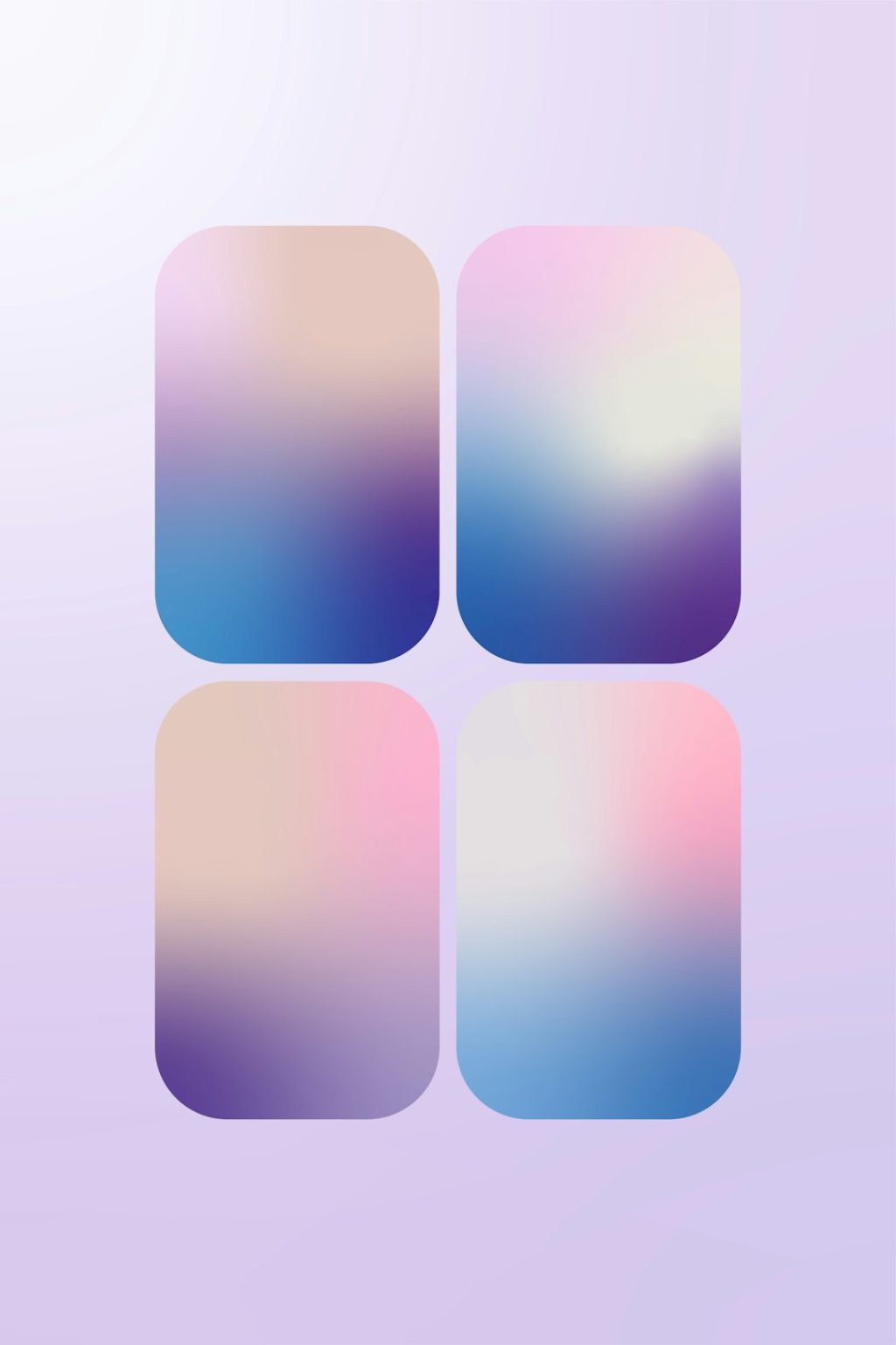
A common mistake is mixing too many colors, fonts, and backgrounds. While Widgetsmith offers many customization options, the most elegant setups usually limit the design to a small palette. Users may choose two or three main colors, then repeat them across widgets, wallpapers, and app icons.
For a soft and clean style, neutral colors such as beige, gray, white, cream, or muted blue work well. For a bold style, high-contrast combinations such as black and white, navy and gold, or green and cream can make widgets stand out. The same principle applies to fonts. One main font creates consistency, while too many different fonts can make the screen feel cluttered.
Readable design matters. A widget may look attractive in the editor but become difficult to read on the actual Home Screen. Users should check contrast between text and background, especially when using photo widgets or light pastel colors.
Make Photo Widgets Look More Professional
Photo widgets are one of Widgetsmith’s most popular features. They allow users to show family pictures, travel memories, pet photos, artwork, mood boards, or seasonal images. However, not every photo works well inside a widget. Images with a clear subject, balanced lighting, and simple backgrounds usually produce the best results.
Before adding photos to Widgetsmith, users can crop and edit images in the Photos app. A square crop is best for small widgets, while a landscape crop works well for medium widgets. On iPad, larger photos should have enough resolution to avoid looking blurry.
- Use bright images for cheerful and energetic Home Screens.
- Use muted images for calm, minimalist, or professional layouts.
- Avoid busy backgrounds when text will appear over the image.
- Create albums for rotating photo widgets with a consistent theme.
Users who want a more curated look can create separate albums for different moods, such as “Autumn,” “Work,” “Family,” or “Travel.” Widgetsmith can then rotate through selected images, making the Home Screen feel fresh without becoming random.
Schedule Widgets for Different Times of Day
One of Widgetsmith’s most powerful features is timed widgets. This function allows a widget to change automatically based on the time of day. For example, a morning widget might show the weather and calendar, while an afternoon widget displays reminders, and an evening widget shows a relaxing photo or quote.
This feature is useful because a person’s needs change throughout the day. In the morning, quick planning information may be most important. During work or school hours, task lists and schedules are more relevant. At night, a calm layout can reduce visual noise and make the device feel less distracting.
A practical timed widget schedule might include:
- 6:00 AM to 10:00 AM: weather, date, and calendar overview.
- 10:00 AM to 5:00 PM: reminders, productivity quote, or upcoming events.
- 5:00 PM to 9:00 PM: fitness data, personal photos, or dinner reminders.
- 9:00 PM onward: calming image, sleep-related note, or simple clock.
Match Widgets With Wallpaper
Wallpaper plays a major role in how Widgetsmith designs appear. A beautiful widget can look out of place if the wallpaper has clashing colors or too much detail. Many users achieve a polished effect by choosing a wallpaper first, then building Widgetsmith colors around it.
If the wallpaper is busy, simple widgets with solid backgrounds are usually best. If the wallpaper is plain, widgets can include more texture, photos, or decorative elements. A transparent or semi-matching look can also be created by using colors that closely resemble the wallpaper background.
For iPad users, this is especially important because the larger screen makes inconsistencies more noticeable. A wallpaper with empty space around the center or sides can help widgets and app icons remain readable.
Create Practical Productivity Widgets
Widgetsmith is not only for aesthetics. It can also make devices more useful. A calendar widget can help users see upcoming events without opening an app. Reminder widgets can make important tasks more visible. Weather widgets can support daily planning, especially for commuting, workouts, or travel.
Productivity-focused users often benefit from placing functional widgets near the apps they use most. For example, a calendar widget can sit near Mail, Notes, and Files. A reminder widget can be placed near task managers or work apps. This arrangement reduces the time spent searching and helps the Home Screen act like a command center.
The best productivity layouts are simple. If a widget does not support a daily habit or frequent decision, it may be better placed on a secondary page rather than the main Home Screen.
Use Widgetsmith on iPad as a Dashboard
The iPad offers more room for creative and functional widgets. Many users treat the iPad Home Screen as a digital dashboard for work, school, or planning. Larger Widgetsmith widgets can display more information while still leaving space for app folders, dock items, and Apple widgets.
For students, an iPad dashboard might include class schedules, assignment reminders, a study quote, and a simple clock. For professionals, it might include calendar events, weather, project reminders, and a clean photo widget. Artists and designers may prefer mood boards, color-themed widgets, and inspirational images.
Keep the Home Screen Balanced
Good widget design depends on balance. If every space is filled with widgets, the Home Screen can become overwhelming. Empty space is not wasted; it helps important items stand out. A balanced layout usually includes a mix of widgets, app icons, folders, and visual breathing room.
Users should also consider widget placement. A large widget at the top can create a strong visual header, while a medium widget in the middle can divide the screen into sections. Small widgets work well in pairs, especially when they share similar colors or functions.
Test Widgets in Real Use
A Widgetsmith setup may look perfect immediately after creation, but real use reveals whether it is practical. Users should test a new layout for a few days before making major changes. If a widget is ignored, hard to read, or frequently in the way, it may need adjustment.
Battery usage and loading behavior should also be considered. Most widgets are efficient, but layouts with many frequently updating widgets may feel less smooth on older devices. If a widget does not refresh as expected, opening Widgetsmith or checking permissions can often help.
Common Widgetsmith Mistakes to Avoid
- Using too many styles at once: A layout with many fonts, colors, and widget types can look messy.
- Choosing low-contrast text: Pale text on a pale background is difficult to read.
- Forgetting function: A beautiful widget should still serve a purpose or create genuine enjoyment.
- Ignoring widget size: Detailed information should not be squeezed into a small widget.
- Overcrowding the main screen: Too many widgets can reduce usability.
Final Thoughts
Widgetsmith gives iPhone and iPad users a flexible way to personalize their devices while improving daily organization. The strongest layouts combine style with purpose: clear information, thoughtful colors, readable fonts, and widgets that match real routines. Whether a user prefers a calm minimalist screen, a productivity dashboard, or a rotating gallery of favorite photos, Widgetsmith can support that vision with careful setup.
By planning the layout, choosing the right widget sizes, matching the wallpaper, and using timed widgets, users can create a Home Screen that feels both beautiful and useful. The best result is not always the most complex design; often, it is the one that makes the device easier and more pleasant to use every day.
FAQ
What is Widgetsmith used for?
Widgetsmith is used to create custom iPhone and iPad widgets for the Home Screen and Today View. It can display photos, calendars, weather, clocks, reminders, health data, custom text, and more.
Can Widgetsmith widgets change automatically?
Yes. Widgetsmith includes timed widgets, which allow users to schedule different widget designs or functions for different times of the day.
Does Widgetsmith work on iPad?
Yes. Widgetsmith works on iPad and can be especially effective because the larger screen offers more room for dashboard-style layouts and large widgets.
Why does a Widgetsmith widget look blank or outdated?
A widget may appear blank or fail to refresh if permissions are missing, the app has not been opened recently, or the device is experiencing a temporary refresh delay. Opening Widgetsmith and checking the widget settings often resolves the issue.
What makes a Widgetsmith layout look professional?
A professional-looking layout usually uses consistent colors, readable fonts, balanced spacing, high-quality images, and widgets that match the wallpaper and overall purpose of the Home Screen.
Is Widgetsmith only for aesthetic designs?
No. Although many users enjoy Widgetsmith for visual customization, it is also useful for productivity, planning, weather checks, calendar viewing, reminders, and wellness tracking.